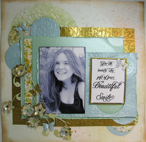
Although my daughter hates this photo, it is one of my favorites, because it shows a true unguarded smile, the real deal, and I wanted to bring attention to it because she doesn’t think she is pretty with out makeup.
The background paper was sprayed with homemade ink mists, then the edges were distressed and inked with vintage photo distress ink. The glimmer card stock (from paper temptress) was embossed with the Cuttlebug machine.the “speckled” paper was glossy card stock which was inked with alcohol ink, this was then used for accents and to make the flowers. The title was printed on plain white card stock and then matted with more of the gold glossy. I used the Duetica Design Studio because I wanted a hand lettered look, and as you can see the end result is lovely, just like my daughter.
SUPPLIES
- Duetica Mandolyn fonts
- Papertemptress.com paper
- Lace paper doily
- Brads
Oh yes, Kristy your daughter is beautiful and so is your layout ! unfair that one person has so much talent! not realy, but to think to put so many different things together on one page and it all looks like it was ment for each other ! Amazing ! Teach me your secrets !
Your work totally ROCKS Kristie! You are sooo talented and I’m proud to say I taught you everything you know. NOT lol!!!