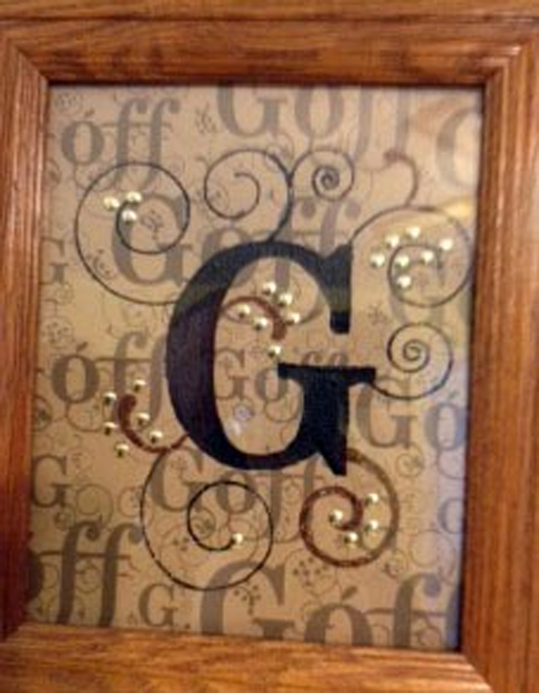
I can’t express enough how much I LOVE Duetica fonts! I was playing with my last name and came up with this beautiful piece. The DT Woodwynds font was perfect for my design. The delicate swirls & dots just gave me so much room to play with in making this a prized piece to hang up on my front hallway so all can see. On Kraft colored cardstock, I printed out my whole name in different sizes all over the page in a light gray. Then right smack in the center I placed the letter G, big & bold. Although you can read the last name in the background, the letter G is what is most eye catching! On the centered G, a thick layer of crackle paint was generously spread. Let dry thoroughly on its own to give the crackling ingredient time to do its job. When dried, I added some foam metal dots where the Woodwynds font dots were. Striking! I just love adding metal in my artwork! Gives it the POP I was looking for.
SUPPLIES:
Duetica Lettering Arts Studio
Microsoft Publisher
Stickles: Black Diamond
Ranger: Distressed Vintage Paper
Gold Metal Dots with foam adhesive
Ranger: Black Crackle Paint
Duetica Font: DT Woodwynds font
